


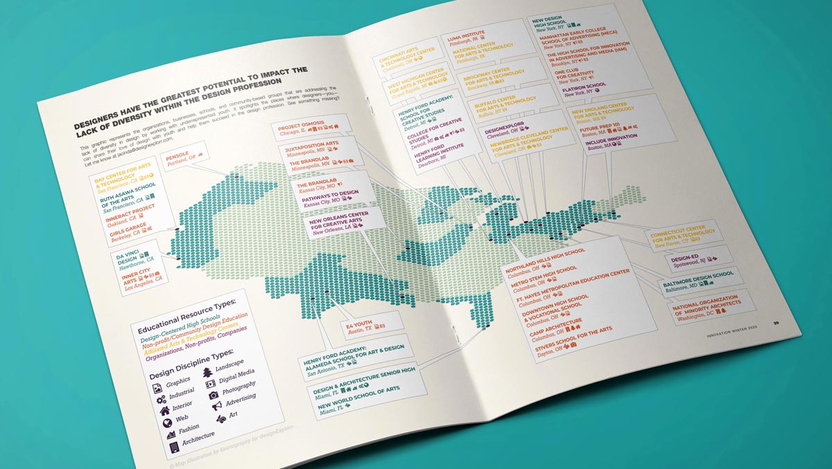
Three years after launching Keirtography, I can draw several conclusions about my mappy side-hustle. One of them is this: while my found-texture fantasy cartography work may be flashier, those big bitmaps aren’t Keirtography’s bread and butter. The true workhorses in this stable are my vector map illustrations for publication or location. These maps must be intuitive and accessible reference tools, created to help users find out what they need to know and get where they need to go as quickly and easily as possible—so they can’t be bulky files with visual clutter.
That’s where vector illustrations come in. For me, that means line-based pieces made with Adobe Illustrator or InDesign relying on text and iconography, with simple but compelling color palettes and only the most essential details labeled or highlighted. The process I developed for creating these pieces builds on decades of design work I did for agencies and partnerships, and that experience helps my clients save costs. Timelines get shorter, overheads get way lower, and the final bill is usually less than it would be if someone else with commensurate experience did this work. Here’s a survey of how I do that.
What Will the Map Communicate?
Maps have one basic purpose: communication. They can convey direct messages in specific contexts, helping a user make decisions and take action. Effective maps help them do that as quickly and easily as possible, but different maps communicate in different ways. Some keep it short and sweet, with few words, symbols or colors. Others beef up their message with rich visual storytelling to engage an audience. Keirtography maps can do either or both; they’re designed in collaboration with my clients to best serve their users’ needs.
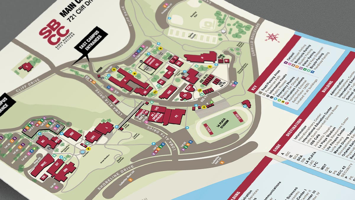
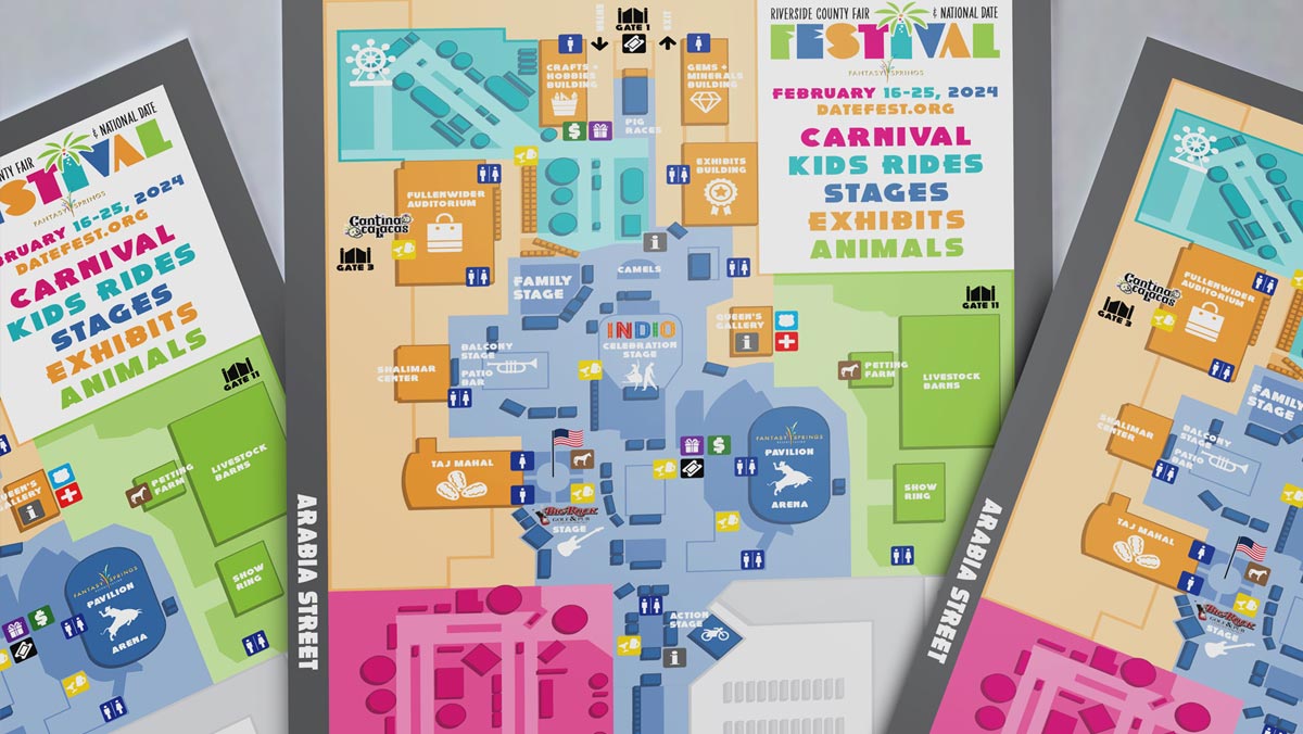
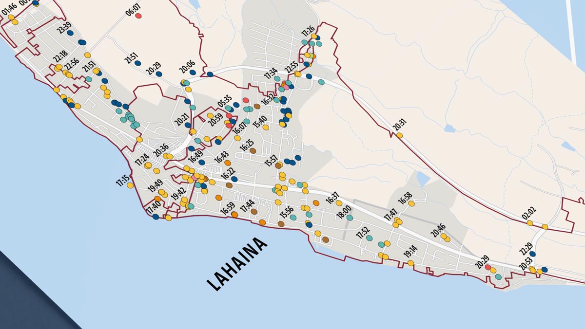
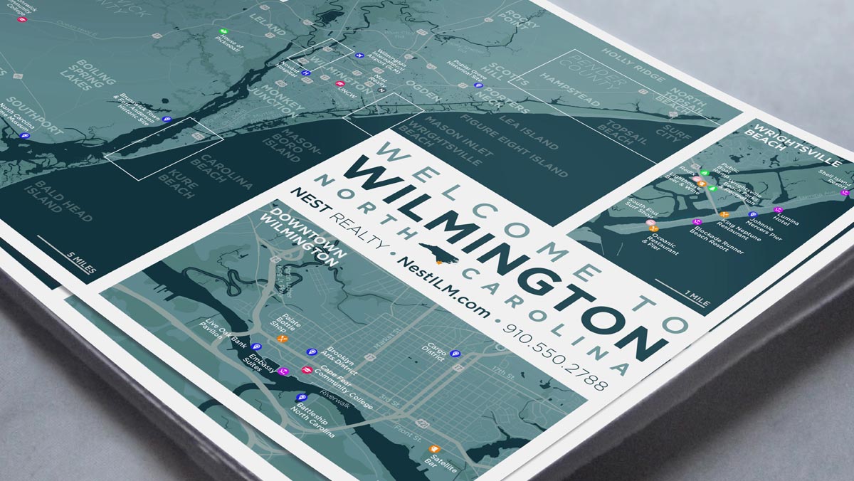
For locations (wayfinding for campuses, facilities, or events; promotion or education by businesses, nonprofits, or associations), a stylish and beautiful digital map illustration helps invite viewers to visit and experience the places those maps depict. For publications (magazines, research reports, self-published novels or memoirs), a visually compelling, easy-to-understand reference map helps authors share their stories, report their articles, or present their research.
Format, Organization, and Quality
At the beginning of each project, I get organized by asking myself (and/or my client) a few questions. How accessible does the map need to be? How much information will it communicate, and how complex should that presentation be? Will users be able to make quick, informed decisions? Doing all this homework first will ensure the final map can walk the talk, as well as keeping my Illustrator layers tab manageable.
Format. Since I’m a map artist and not a capital-c Cartographer, I create static map illustrations—not dynamic, data-driven, or interactive GIS applications. Static maps work well for both print/fabrication and digital presentation, but since they’re static they’re limited to a given size and shape vis a vis amount of information. However, that also means they can be more artfully embellished to better suit a given branding or communications goal.
Quality. A static, printed piece can exist as part of a collateral suite, but it should stand out from the brochures, posters, business cards, etc. to convey essential details in a limited space. A standalone printed piece may contain more rich illustrations or more detailed information than collateral-integrated pieces. In either case, the final deliverable will be a PDF, either made at conventional print preflight dimensions (letter, tabloid, etc) at a large file size, or at a more lightweight and web-friendly file size for easy uploads and downloads.
Tools and Resources
One of the first things I learned as a creative professional was to avoid starting from a blank canvas. There are literally thousands of tools and resources out there to help do just that, but for the sake of brevity and sanity I usually limit myself to what I know and what I can work fastest or best with. That means digital tools over hand-drawn stuff (because I’m not a capital-I Illustrator either), and digital tools usually means Adobe (because, expensive monopoly they may be, but for me nothing else—Gimp, Affinity, whatever—really measures up).
As for resources, aside from any client branding assets (logos, typefaces, color palettes, etc.), that usually means vector base maps and iconography. For maps, sometimes a quick search through Vecteezy or Freepik is all it takes to find free and editable nation/country or state/province maps in various vector formats (usually SVG or EPS). Those sites can work well for icons too, but if you need certain styles or a wider selection, the Noun Project is also useful. If you want to work with icons as typefaces, try FontAwesome.
Some projects need a more detailed base map, though, so when I need a vector city map to zoom in on, or pull details from, many cities have excellent vector maps accessible on their official municipal sites, also free. However, most of these often need some serious editing to make them usable in projects they weren’t created for, so that time may cost as much as paying for a new stock map image.
Here’s more from my own pool of traditional/static map resources, to which I’m always looking to add:
- Wikimedia Commons: free vector-based maps, but you’ll be digging for the best results.
- Free Vector Maps: limited selection of non-detailed, blank maps of countries.
- Open Street Map: better choices, drilling down to the city level for most geographical areas.
- Map Resources: good selection (to large city level) for a fee, but pricey.
- NetMaps: good selection with the most variety, but all very expensive.
- Digital Vector Maps: wide selection—continents down to mid-sized cities—and slightly cheaper.
Styling Color, Type, and Icons
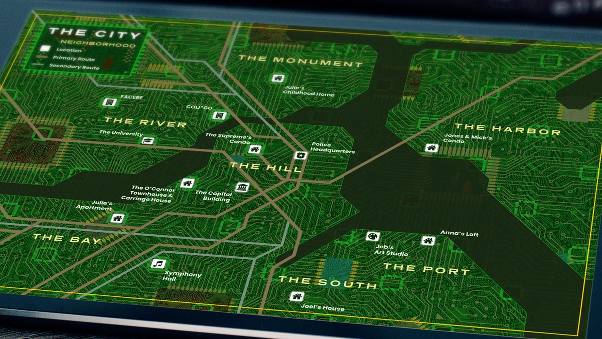
Creating a unique and compelling style for each map helps it both look good and work well. On static maps, I try to include only the minimum essential information. I use purposeful colors, legible type, and meaningful icons within a logical visual hierarchy—what the viewer should see first, second, third, and so on. Other things I consider: how will I differentiate place names? Are my icons understandable on their own, without captions? Do the important elements stand out well against the background?
Avoiding visual clutter with a good hierarchy that makes sense at a glance is the key to successful map styling. If there’s a substantial amount of information to convey, and I need to differentiate beyond color, type, and iconography, I try to work with size, shape, orientation, texture, or position—all while keeping visual hierarchy in mind. Applying that hierarchy to each of those elements might look like this:
Color. I try to choose or work with a palette that allows quick interpretation. I start simple (or not—but more on that later): blue for water, brown or green for land, and gray for roads. If I’m working within an existing brand style guide, I might go for a light-to-dark range of those colors or even tints of one color. More colors (but maybe no more than six) combined with a tint range can differentiate further. Depending on the project brief, I can also work with an object’s shape, size, shade, or texture to make the map more accessible for colorblindness.
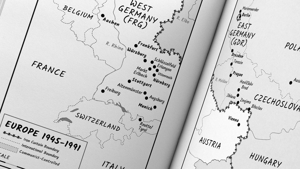

Type. For labels and place-names, I like to keep the number of typefaces to no more than two. I use sans serif fonts for fast recognition of prominent items and serif for subordinate items, with (sometimes, but not always) regular case for human-made features and italics for physical features. Matching the type color with the feature’s color makes for easy legibility, like dark blue over light blue for water. A thin stroke or halo around the type matching the background may help increase legibility or contrast.
Icons. In my experience, the best icons for map labeling are simple, recognizable, two-dimensional shapes. I avoid extraneous details like perspective, shading, or other skeuomorphic tactics; flat design is usually fine, but if I want to show a little dynamism I might incorporate gradients, but sparingly. Icons may also need to be the same color or same color range to avoid visual clutter, as well as be generic and geographic symbols of common places or things, like parks or piers. The map’s context may allow abstract shapes (circles, stars, or other shapes), but if it’s place-specific and needs to appear so, I’ll definitely go with a unique symbol, such as the Eiffel Tower.
Accuracy in Map Illustrations
I used to get hung up on cartographic accuracy to an almost self-destructive degree, but once I understood how needlessly harmful and judgmental phrases like “mapfail” were, I mostly got over it. No map is truly 100% accurate—flat maps distort the round earth and round globes distort the large earth—but I still believe basic geographical accuracy is as critical as correct spelling. Absolute accuracy isn’t needed—but for the most part, labels, location and distance have to be correct. It’s essential for accessibility and convenience, and speaks volumes about the mapmaker’s overall values.
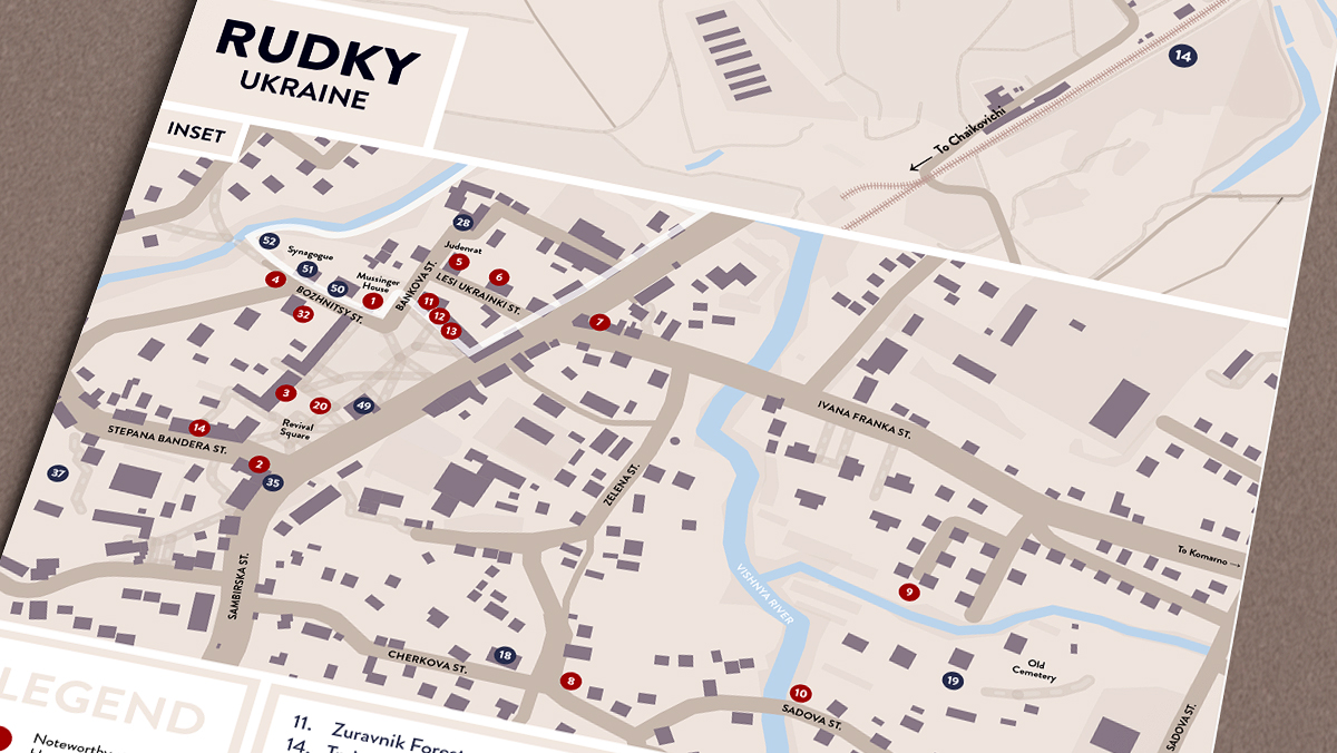
What must be accurate? Labels, for one; I make sure each point of interest is named correctly. References should be accurate too, because while every map might not need a north arrow or legend explaining each symbol or icon, if there’s any room for misinterpretation, then I go for clarity instead and add ’em in. Locations and orientation should definitely be correct. Is the hospital icon at the correct cross-street? Is the road really that curved? If there’s no north arrow, which way is up? A user-based or compass-based orientation can help with that. Finally, distances often need to be right-on as well. I don’t worry much about scale at zoom levels, since I don’t work with dynamic stuff like web- or app-based maps, but in print, I like to include a reasonably accurate scale bar. If one inch equals one mile in reality, that’s gotta be reflected on the map.
It’s fine to fudge a bit with other elements, though. Colors can and probably should change; a body of water doesn’t have to be blue if viewers understand it’s water. If the map can be an obvious illustration, go wild. Beauty over accuracy is totally forgivable with, say, a courtesy note of “map not to scale.” If I’m making a tour map, I omit information from the tour route if it’s non-essential, or to reduce clutter, but the important stuff is always there. Incorrect street names or route numbers can be just as bad as putting Hong Kong in Brazil or showing Arkansas as Arizona (it’s happened, I promise).
I’ll Be Your Favorite Maphead
For the sake of a conclusion I’ll simply get real and say that much of this post was repurposed from an e-book called “Map Design Essentials: Rules and Tools for Event Professionals,” which I created while running an event branding company called Tight Ship Design. That ebook was tied to this post about map design principles for event planners. However, since I made one of the above maps while at Tight Ship, and lots of this stuff still applies to what I’m doing now, I figured it might help get noticed by whatever’s left of search engine optimization, or might even help me appear knowledgeable. I’ll never get tired of making maps for worldbuilding or map art, but vector maps of real places is what brings home the bacon here, so if that’s what you’re looking for, reach out. I’ll be your favorite maphead.