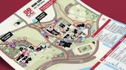
Minor update for a major Keirtography portfolio piece! This month I got to revive one of my best projects from the Tight Ship Design days and make it true Keirtography: the Santa Barbara City College campus maps. I’ve always been very proud of this project and enjoyed revisiting it to keep things current (its portfolio entry is here).
Back in 2018, I helped the SBCC Communications Office create new maps for their Main Campus and two satellite campuses (Wake and Schott), the first time any of those maps had been updated since 2004. This time, I made detailed edits to the Main Campus map, plus integrated a fourth map, Transportation, with my original Main Campus map.
For each go-round, I standardized brand identity across all the maps, paying special attention to visual hierarchy & iconography. The final maps are versatile (for use online, in print publications, and on-campus kiosks), visually hierarchical, and beautiful—so a user can, at a glance, get where they need to go.
A bit later in 2018 I also did a style guide revision, SBCC’s first in 14 years. Style guides are always fun (I’ve made several), and in this case I established uniform, consistent, and easy-to-follow standards and procedures for campus departments and organizations using the SBCC branded identity assets.