

Homeworlds Digital Map Illustrations
Some years back I got attracted to unintentional or unconventional digital art: imagery created by accident, by artificial intelligence, or by using digital tools in ways they weren’t designed to be used. That kind of serendipitous creativity—the seemingly chaotic imagery of randomized errors, glitches, and other “mistakes”—is a rich and vast topic, so I started exploring it by picking up a digital map illustrations thread I’d dropped years ago on vacation in the middle of nowhere.
My family is scattered all over California, so for my mother’s birthday in Spring 2012 we met in a relatively central location: Piedras Blancas, on the coast north of San Luis Obispo. We pooled resources to rent a fancy villa near Hearst Castle, surrounded by nothing except coastal wilderness: green hills, crashing waves, barking elephant seals in the distance, and the occasional car on Highway 1.
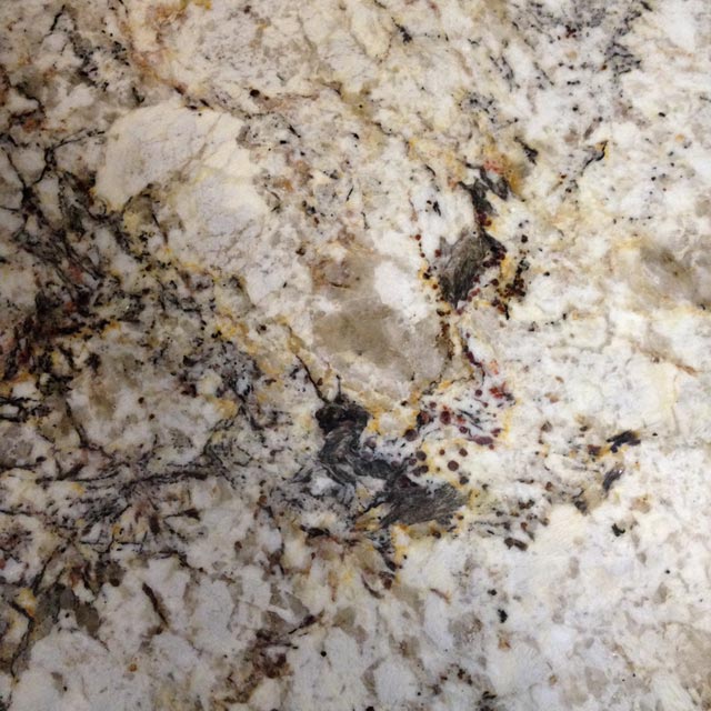
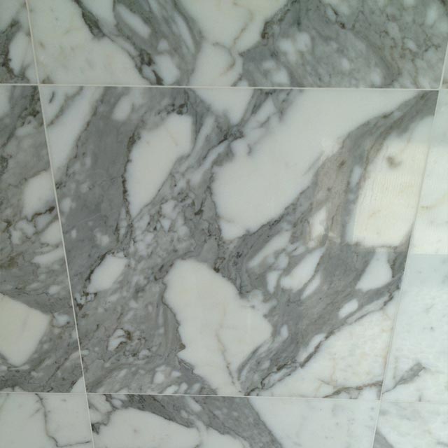
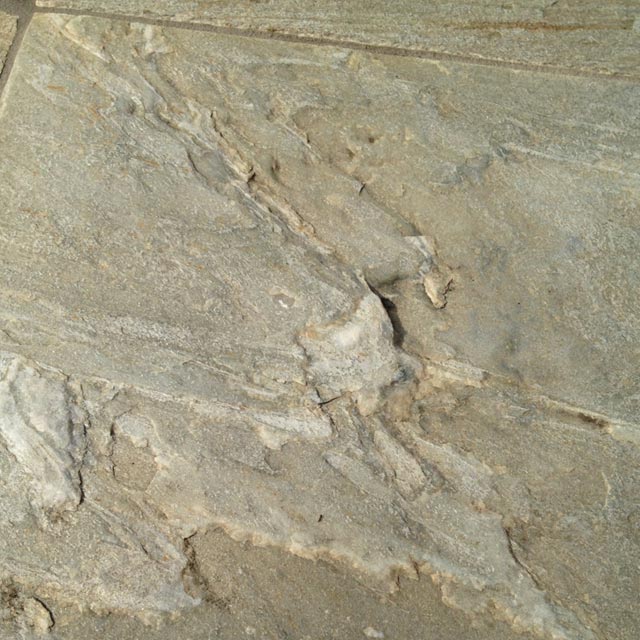
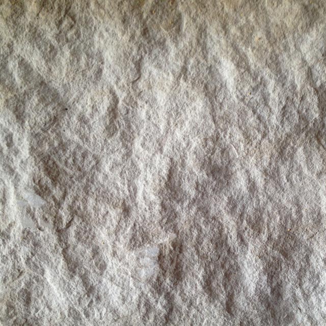
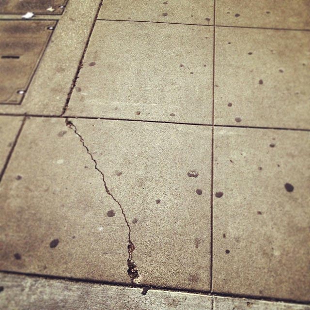
The villa itself was a treasure trove of texture—rough stone, polished marble, and myriad metallic surfaces—and I spent way too much time snapping quick photos of everything all over the house. For an incurable map nerd like me, these textures resembled, in miniature, the topographic features of physical maps.
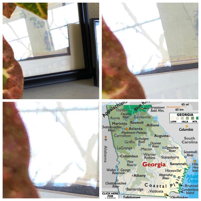
I was trained to be a word guy, with a background in English Lit and journalism, but as a designer I’m also a visual learner in many ways, especially when it comes to maps. I remember unique shapes in detail, and I see maps everywhere—on the sidewalk, on gym floors, on car windows after rain, and even in reflections of other maps. Notably, I also saw cartographic shapes hiding in the tiles of my mantel at home.
I’d been making my own fictional maps for decades—more on that in a future post—so inspired by the Piedras Blancas imagery and the then-new Game of Thrones TV show, I tried integrating the villa’s textures with my own made-up landforms. The results were inconclusive, maybe because I was only working with shapes and not the textures themselves. I wasn’t making connections between the textures’ topography and the fictional features I wanted to create, so I set the project aside.
I never forgot the initial idea, though, and once smartphone-app technology advanced to the point where those apps could be as creative as any desktop Adobe program, I tried something new. Part of my “March Mapness” Instagram challenge in March 2018 was creating hand-drawn maps and then restricting myself to digitally editing them only on smartphone apps. I realized that app-only approach could work with the older 2012 textures, and tried that out.
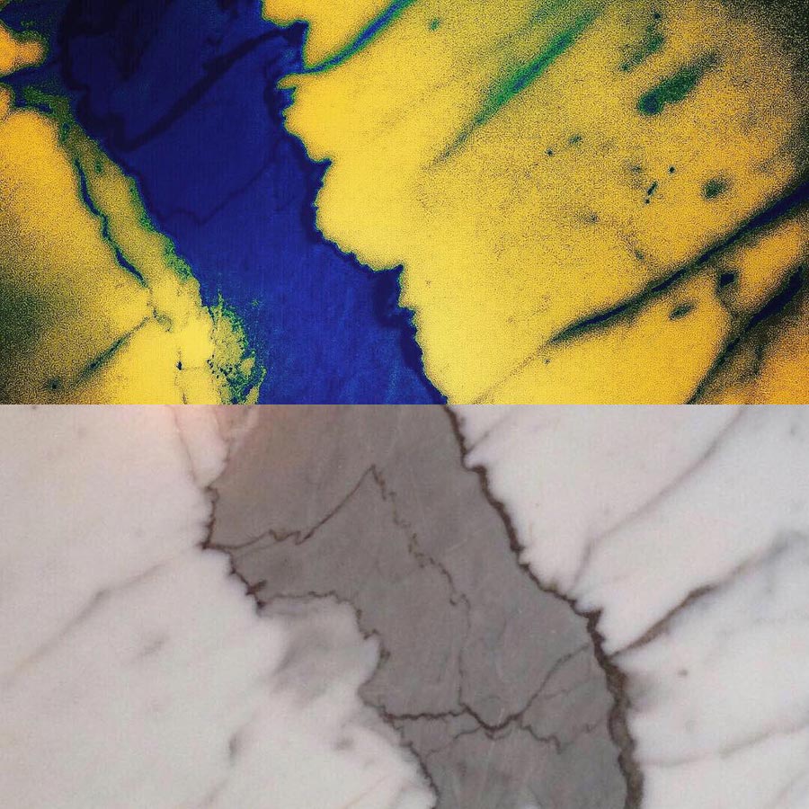

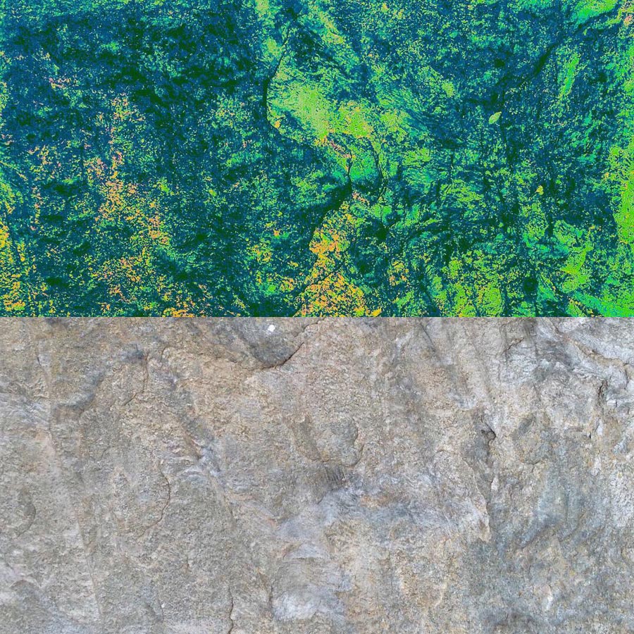
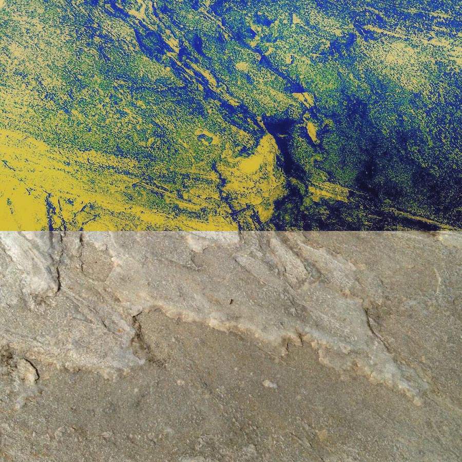
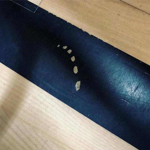
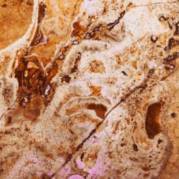
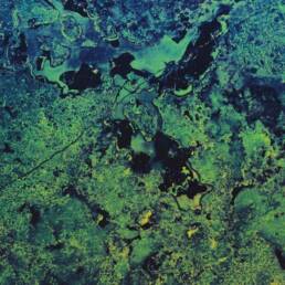
Those results were interesting enough to keep going, so I did the same with new (2019-quality! High-resolution!) snapshots of found textures from all over my own home: tile, linoleum, cement, drywall, and more. The geographic shapes were there, but so were other faux-natural phenomena like erosion and fault lines, so I ended up with lots of material to work with.
From there, and using only smartphone imaging apps like Camera Roll, PS Express, and Instagram, I created a series of quickie satellite-like insta-maps, transforming ordinary household surfaces into sky-high overviews of planets not unlike our own. Coastlines, forests, deserts, glaciers, swamps, and rivers burst into life off my iPhone screen.
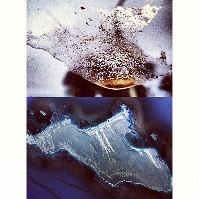
The process (for two particular examples from tile) looked like this:
DESERT
PS Express:
Filter: Nature, Colorful
Instagram:
Filter: Lark 75, Contrast 25, Warmth 40, Color (shadows) Red 25, Shadows -15
SWAMP
PS Express:
Filter: Basic, Invert, Light: Contrast 100
Instagram:
Filter: Perpetua, Lux 50, Color (shadows) Blue 100, Color (highlights) Yellow 80, Saturation 100, Brightness -15, Warmth 40, Highlights -15
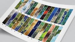
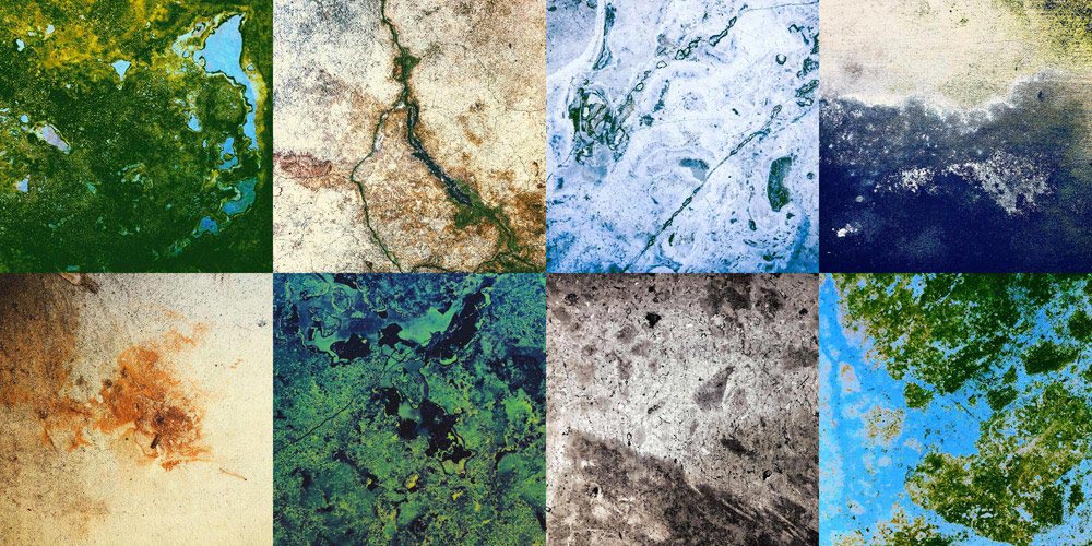
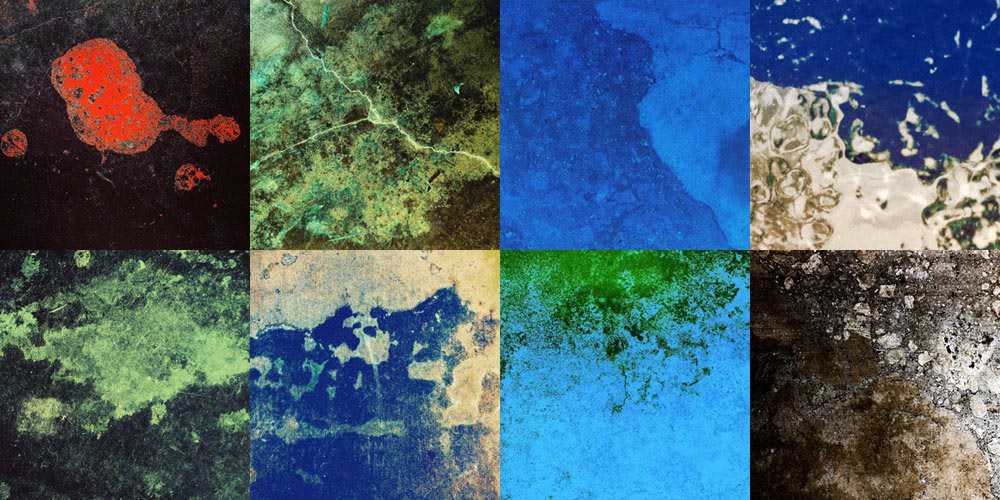
These “homeworlds” would end up being my next Instagram series, but I knew from past experience that daily posting could turn into an irregularly-occurring slog if I tried creating one piece per day. April 2019 would be busy for me (an AIGA design conference and a UCSB Daily Nexus reunion), so I decided to syndicate the whole series. I blasted through thirty images (and many alternates) during a rainy March, then posted each new piece for every day in April to the #homeworlds_2019 tag on Instagram.
The series lives online in its entirety, but I’m a sucker for poster design, so I created something special to commemorate this series: a side-by-side compilation of details from each of the 30 Homeworlds, available at the moment (like the 50+2 project before it) as a print-on-demand poster.
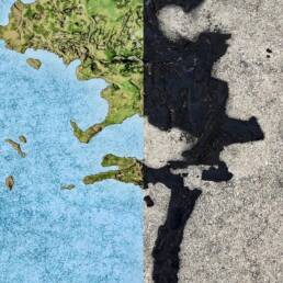
It was great fun, and even better it immediately pointed to another passion project I could get lost in for a few months. See, the final “homeworld” wasn’t from my home at all—it was an asphalt/tar spill on the sidewalk in downtown Santa Barbara, a ready-made fictional island that needed just a bit of color-correction to make a self-contained, found-texture fictional map. Needless to say, I got to work immediately. Stay tuned for the results!
Homeworlds Digital Map Illustrations
Digital map illustrations: Keir DuBois’ “Homeworlds” maps series made from smartphone imaging apps, transforming household surfaces into faux-satellite overviews.
Servicesmap design, digital map illustrationYear2019Linkwww.instagram.com