

Please forgive the terrible title puns, because the project I completed just last week was a bit of a saga. While it was never contentious, and there was indeed a happy ending—born from 360 degrees of professionalism displayed by all involved—things definitely didn’t go completely as planned for me or my client, the Denver Botanic Gardens. My first-round originals ended up unused, but I think they’re still notable and I’m gonna get into why. Before I do, though, two quick notes.
One: I usually don’t show in-progress versions. Despite the occasional process piece, I’m not much of a process person. Whether it’s unearthing old song demos or keeping un-refined design work, I don’t often favor that “process is part of the art” idea. Two: I’ve also recently said this blog will no longer do the quickie “here’s a thing about finishing another project, with more details on its portfolio page” posts. So I’m doubly contradicting myself with this. However, contradiction is balance! In this case I think it’s important, and I’ll briefly discuss why.
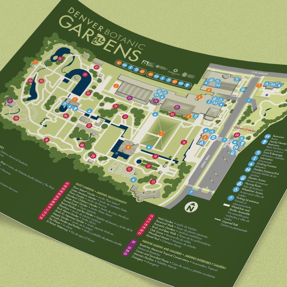
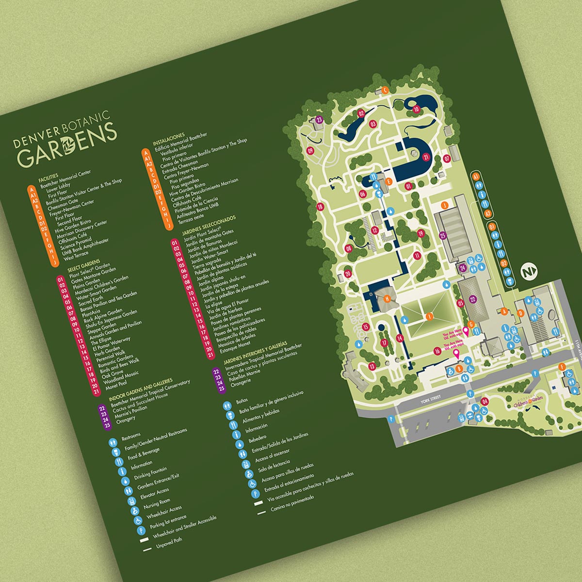
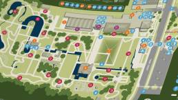
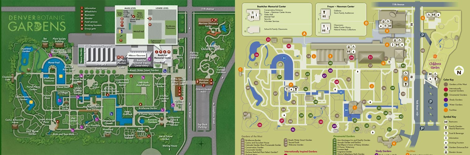
So yes, a saga. Sounds dramatic, but what else would you call a big-budget project that, halfway through, changes scope, deliverables, and even managers? When original work is scrapped to rebuild with disparate elements created by several previous designers? That’s sort of what happened here. I was tasked with making six maps—three signs and three online PDFs—but after one round, and indeed nothing to blame other than unfortunate circumstances, the project suddenly went in a different direction, resulting in what appears on its portfolio page.
Those results are visually compelling enough, but just because my initial delivery wasn’t chosen doesn’t mean it missed any particular mark. My first-round work was certainly bold; I chose to go beyond the brand guide’s color palette for a more vibrant look on both the five DBG-branded maps as well as the one special-event, “Blue Grass, Green Skies”-branded piece. Neither the pastel-and-drop-shadow 2024 version, nor the darker-green, foliage-fringed version before that, but a rich contrast to both.
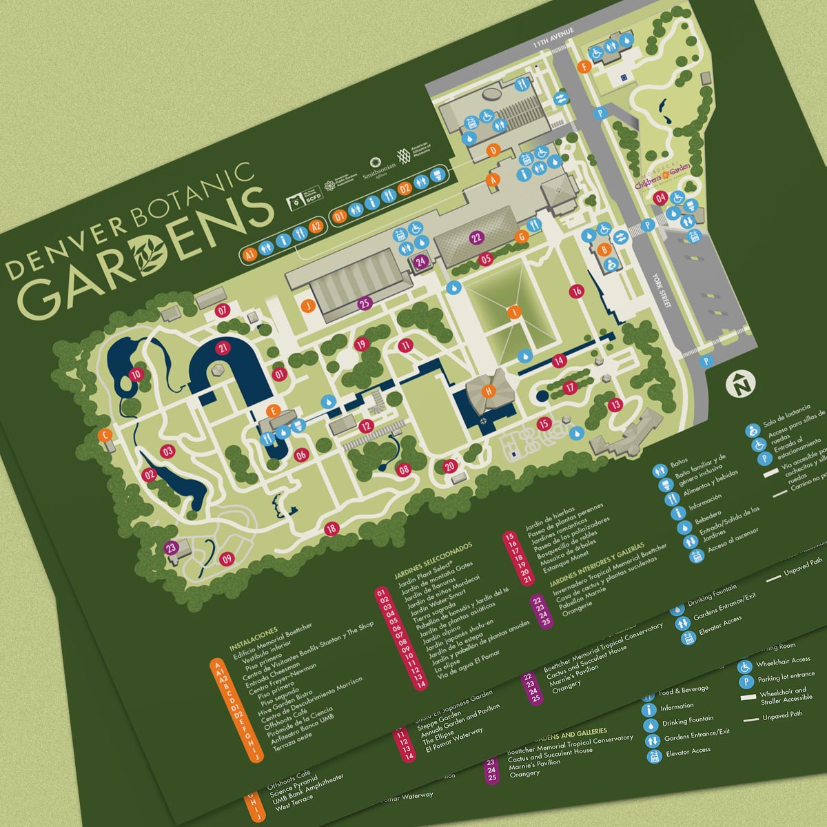
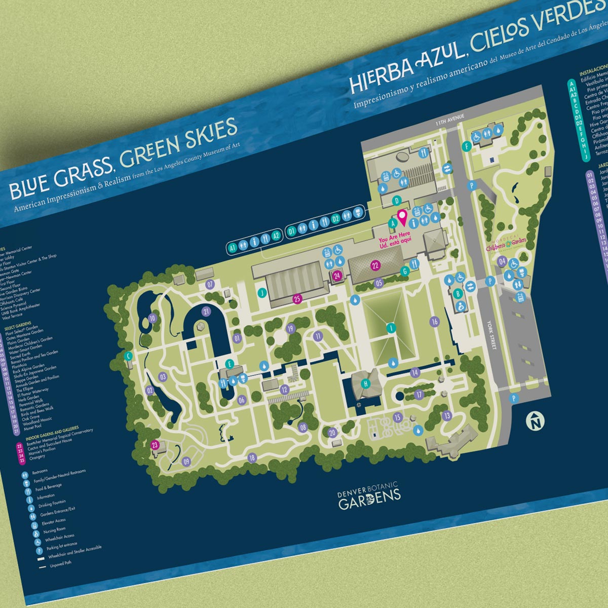
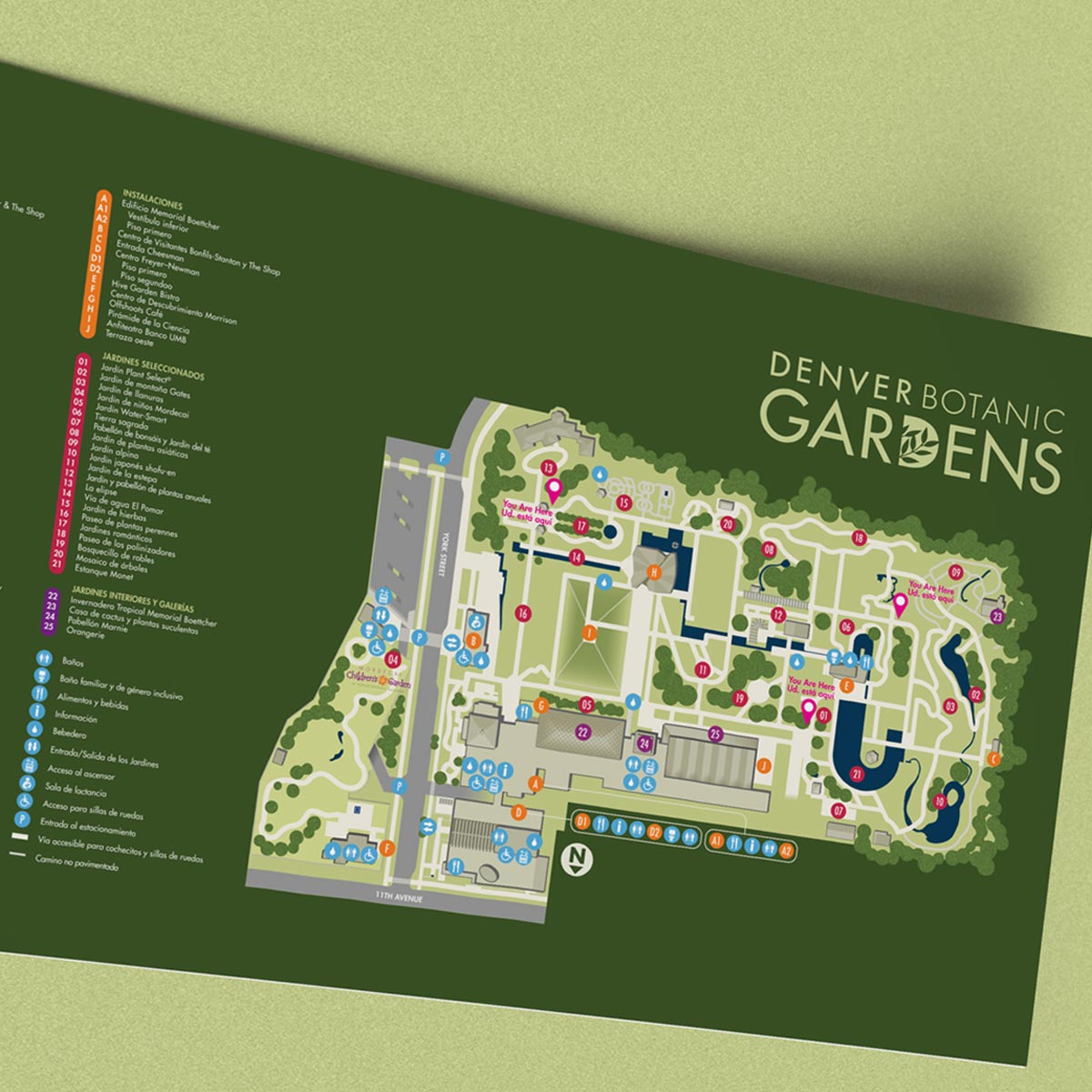
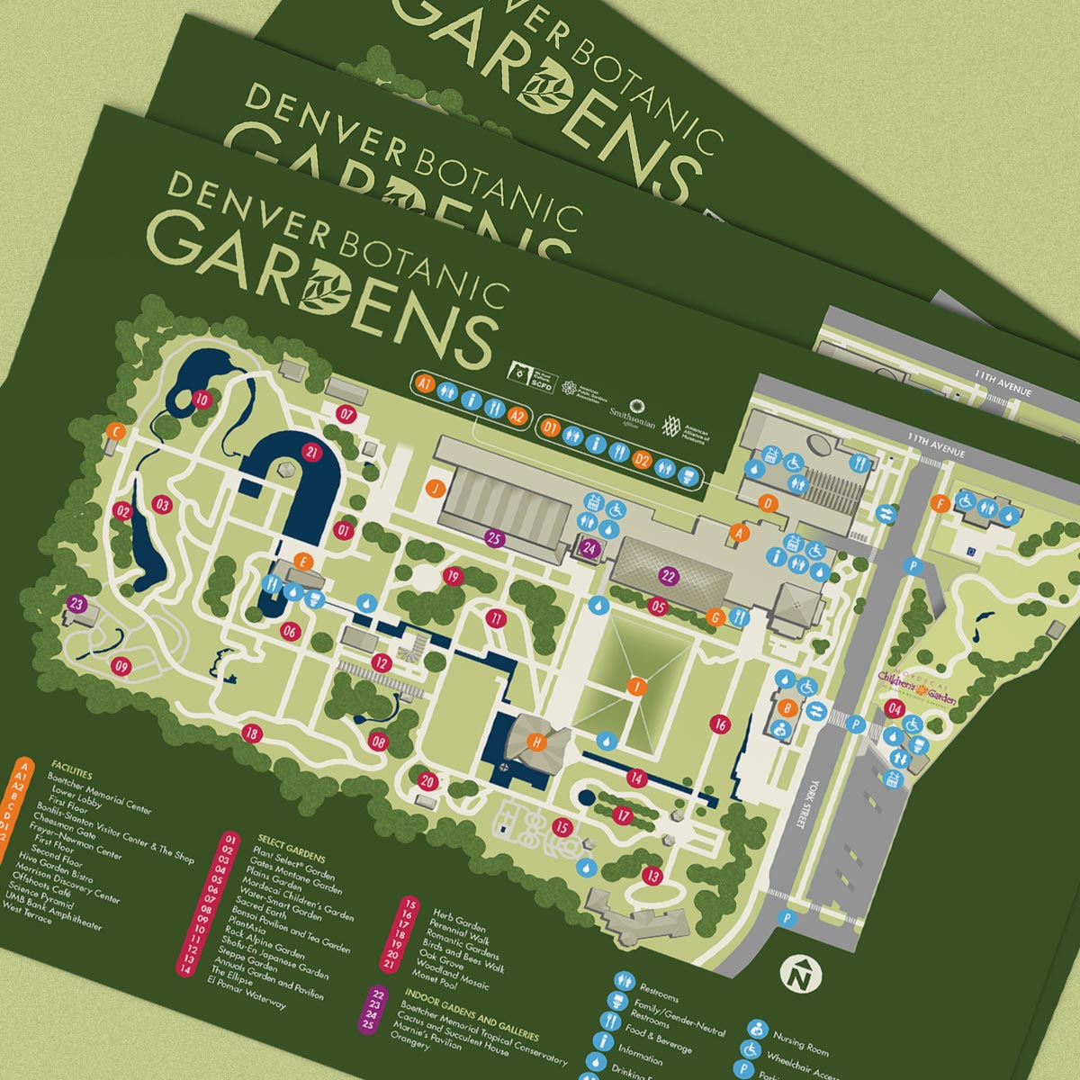
Another big help was the client-supplied pared-down list of required labels and points of interest. This was to make things relatively uncluttered and ideally keep re-layout at bay. Like the aforementioned previous versions (which I did not create), most of these maps were to be bilingual—and as anyone who’s worked on multilingual layouts can tell you, different languages often require different layouts. So, fewer labels (as well as smaller or non-existent insets for multi-floored buildings) would help ensure less clutter and more visual consistency across all six maps.
A third key component was using only one base map across all six pieces, despite multiple orientations for signage (south-facing, east-facing etc., depending on the sign’s onsite location) versus online PDFs (which usually default to north at top). Previous versions (again, not mine) not only used multiple base maps but also included every label in those base maps—needless extra work. Part of how I differentiate myself as a map artist is keeping hours down and therefore overall cost down, so my base map was blank, and free to re-orient as needed, with only the label-dots requiring editing for each separate sign.
There were many other small refinements and innovations here and there, but aside from including the in-progress visuals (mocked up here a bit for a little extra verve) I think I’ll leave it at that, because ultimately none of these pieces matter beyond this post. We successfully stuck the landing when completing the project, and I’m well-compensated for my work. Professionalism matters more! When a project goes unexpectedly sideways, everybody’s gotta roll on with mutual respect, and that’s exactly what we did. Thanks to Hannah Craft, Rachel Murray, and the DBG team for hanging in there with me.