

Keir By Bike & Tour DuBois Data Visualization
Project
Most of my accomplishments these days are cumulative. Staving off life’s mundane mishaps gets easier if there are boatloads of small victories to balance out a given day’s (or month’s, or year’s) mistakes. Big individual wins are always fun, but to me they’ve felt few and far between for about a decade, so racking up positive data for a big annual year-end dopamine-recap rush has become very addictive.
Nothing spawns data like repeated actions, and after six years’ worth of cycling for my health (a 2013 New Year’s resolution that stuck), I had lots of great raw workout data to pore over, reshuffle, and extrapolate. As a designer, visualizing data has been part of my work for years—so the opportunity to combine cycling, design, and maps (via the basic Map My Ride app) hit a trifecta for me.
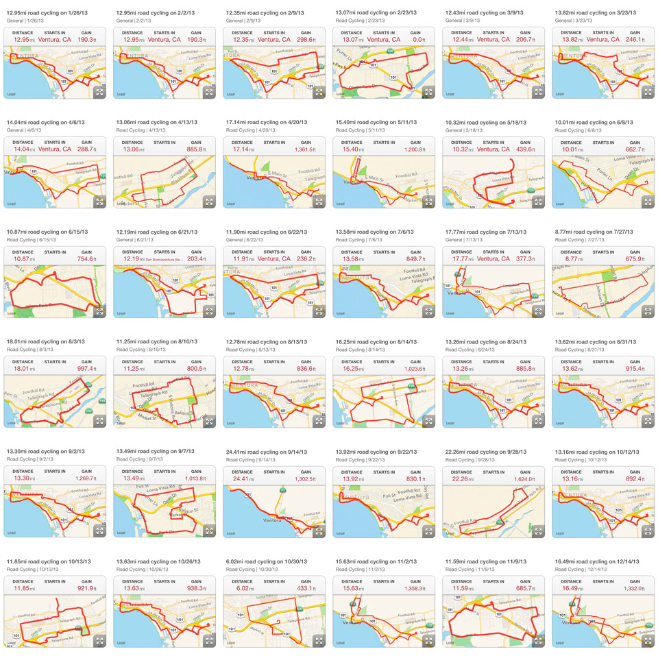

I would screen-shot and save the route map of each completed ride, but “Keir By Bike” didn’t become a Real Project for a few years. It was just a fun way to lose 25 pounds and make a satellite in orbit draw lines on a map using a smartphone—and the ways I showed that (usually via Instagram) were haphazard and not very thought-out. They certainly wouldn’t pass for “professional” data visualization at all.
However, after three years I had lots to work with—and not just in a data sense, either. As I got in better shape, my weekend rides around town got longer, and when I began working remotely on Fridays, I had another day to add another ride, weather permitting (drought is terrible for California, but it’s great for my data set).
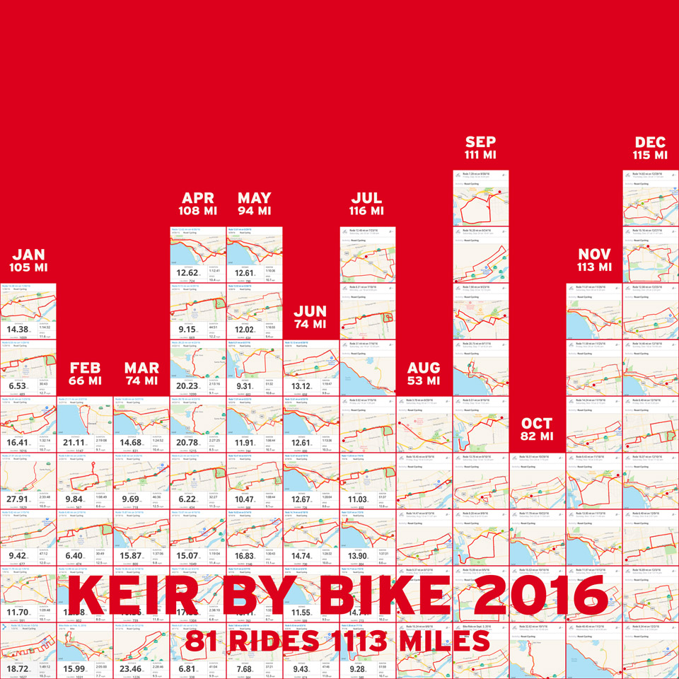
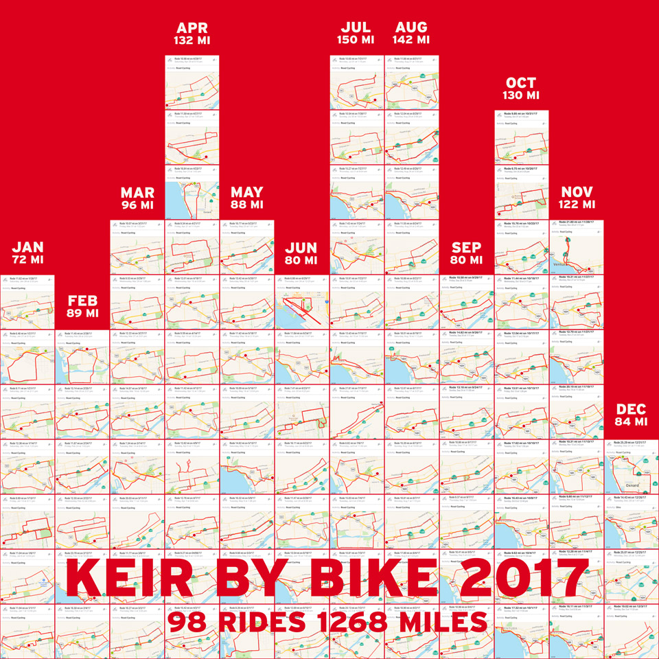
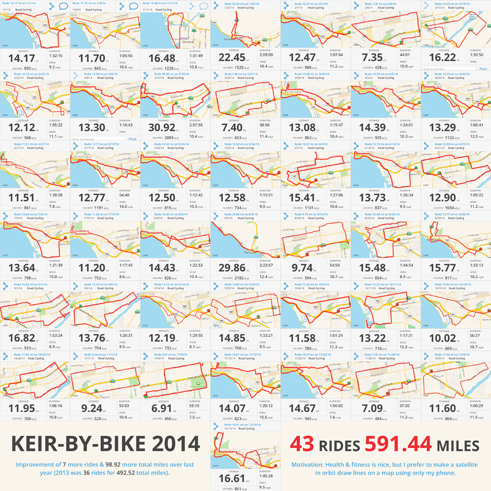
I standardized the 2016 image set by making a bar graph of screen shots in twelve columns (one for each month), noted the total mileage, compared it to previous years, and adopted the Map My Ride app’s color palette to match the screen shots. Applying that retroactively to previous years and then later for 2017 was a snap. Well, many hundreds of snaps—the screen shots—but it was easy, which is what I needed in the year of Tight Ship’s launch.
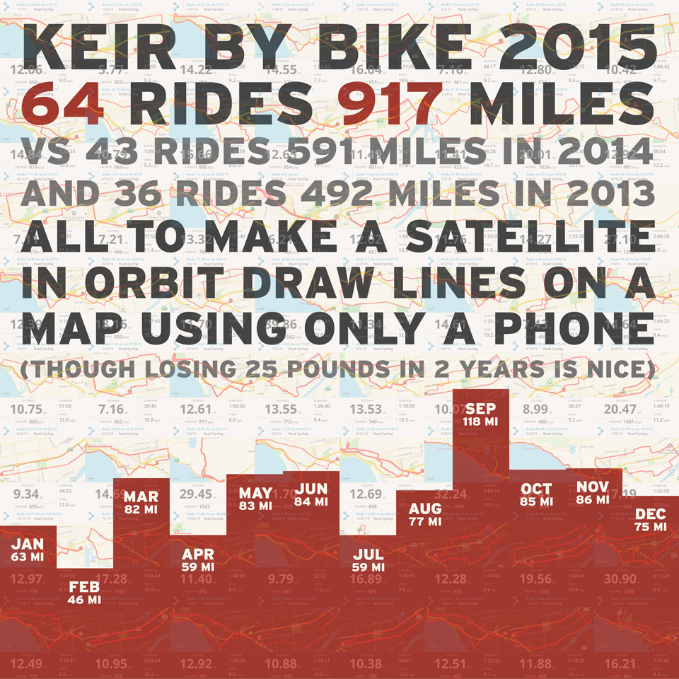
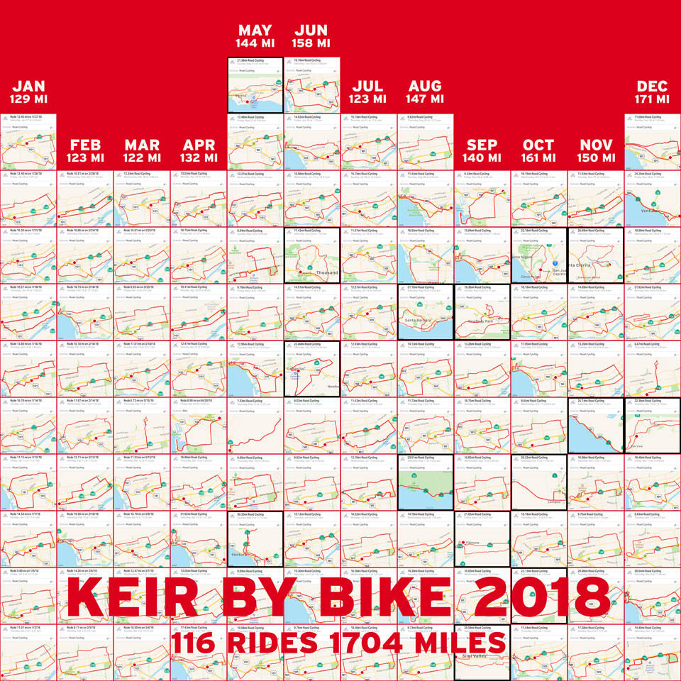
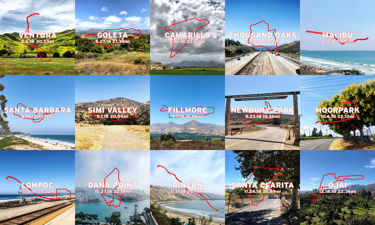
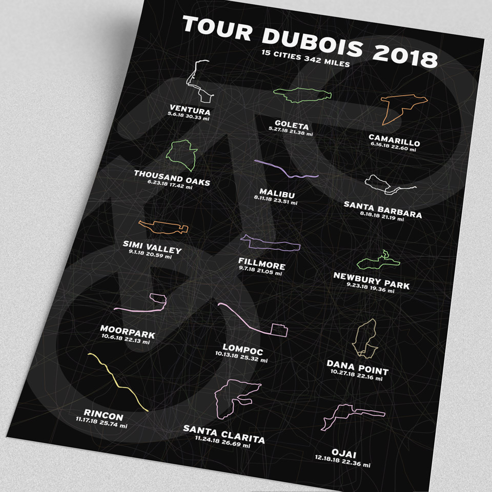
By 2018, I had more time to ride, was in my best shape, and logged almost 500 more miles than 2017. Previously, 20+ mile rides were infrequent (30 miles around Ventura in 2014/2015, 40 to Rincon and back on my 40th birthday in 2016), but for variety in 2018 I biked fifteen out-of-town rides. I’d drive to neighboring cities outside the Ventura-Oxnard area and then ride 20-30 miles in a new place. I called this the “Tour DuBois” and enjoyed snapping local scenery and mapping my rides’ extended range across four SoCal counties.

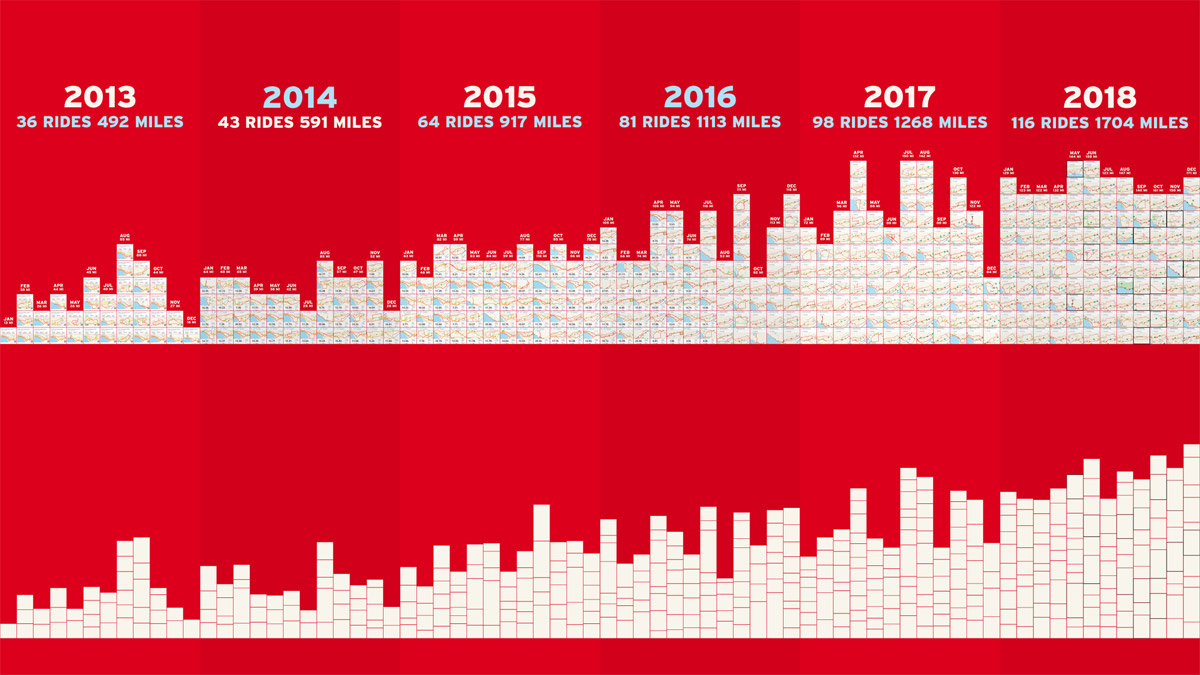
However, all these long rides made the bar graph method less accurate. Showing one month with 9 rides for 140 miles and the next also with 9, but for 161 miles, was a confusing distortion. Stacking rides relative to mileage helped show number of rides and actual miles, so I retroactively applied that to the 2013-2017 data to more accurately represent my past six years of cycling.
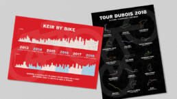
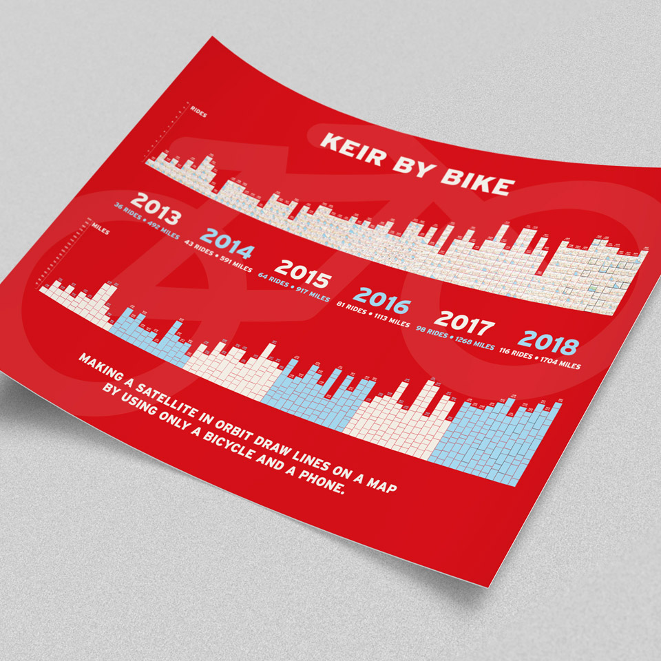
The payoff, like for previous cumulative passion projects, was expressing this accomplishment visually with fun and compelling designs. I’m a sucker for posters, so I compiled the “Keir By Bike” bar graphs into a side-by-side comparison poster, and then displayed the fifteen “Tour DuBois” route images (colored to match their shades in the old Thomas Guides) in a grid on their own poster.
These two superficially simple pieces put the cherry on top of a wildly polar year in life and business, in which (among other things) I recovered from a scary medical issue, ended my volunteer side-gig commitment after seven years, and helped steer Tight Ship through the feasts and famines of freelancing.
Cumulative accomplishments may not seem like much as they happen, but they can be more impressive with even the most basic data visualization. This project was a great reminder when I needed it most. Thanks for the indulgence and follow #KeirByBike on Instagram and Twitter for more in 2019!
Keir By Bike & Tour DuBois Data Visualization
ClientSelf-directedAgencySelf-directedYear2013-2018Linkwww.instagram.com