

What do designers design when they design for designers? In a Tight Ship podcast episode, my co-captain Julia and I mentioned our tenures as presidents of our respective local AIGA chapters, and how that experience with the professional association for design was a critical motivation for launching Tight Ship.
Leaders of local AIGA chapters care profoundly about their creative community—advocating for the value of design to business, government, and society. Frequently, this advocacy happens at their local design-related events: guest speakers, film screenings, workshops, and more.
Like all events, AIGA events need branded promotional identity, and the stakes get raised when event attendees are all capable designers themselves. Every chapter and community has its own style and favorite aesthetics, so there’s always a lot to consider, but the objective is always design that is both ahead of the curve and flawlessly executed.
After all, this is where designers flex for each other, showing off their chops and their taste. If the audience is creatively sophisticated, should the event promotion deliver more than the basic 5 Ws of the event? Can it evoke some other figurative meaning? What will that imagery look like if it needs to scale?
Every local AIGA chapter is volunteer-powered, but while some have programming directors with entire event planning committees behind them, our tiny outfit couldn’t always count on that. What often happened was individual board members planned and produced one to two events per year, sometimes with help from a few other volunteers for extra brainstorming and muscle power.
That translated to event branding in several ways: studio tours were frequently branded by designers in-house at those firms (some great examples from my presidential tenure: Makers & Allies, Silverander Communications, Verdin Marketing, and iii Design). For yearly portfolio reviews, we’d get help from a previous student attendee (like in 2014 and 2016).
Our guest speakers or presenters might even create their own visuals, like TypeEd for Wine & Type Pairing, or Joya Groves for her Indigo Dip-Dye workshop. Most often though, it would come down to one of us on the board producing the event artwork—but for me that was still a great way to stoke enthusiasm and make the event feel real before it became real.
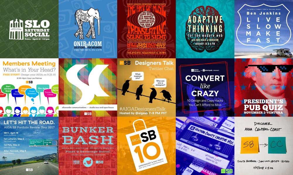
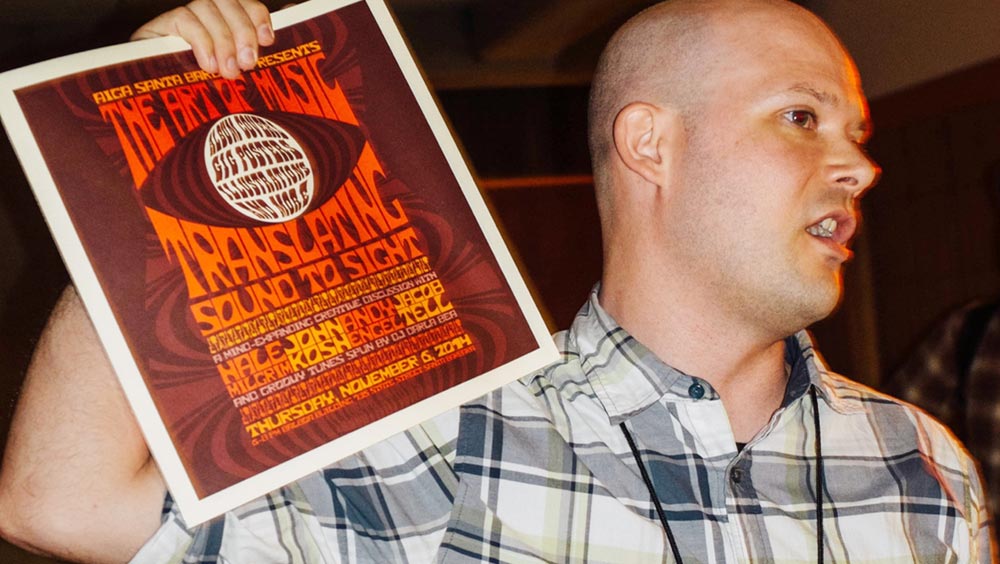
As communications director and then as president I created or helped create event branding for AIGA Santa Barbara from 2013-2018. Two of my best AIGA event branding projects are already in Tight Ship’s portfolio, The Art of Music (2014) and Convert Like Crazy (2016). This post won’t tackle every piece I did for the chapter, but it will cover five recent favorites.
I’ll do a quick survey of each, with background for the events themselves and the creative decisions I made when branding each piece. Most were done with the attendee experience in mind, with one exception—the first piece below was slightly selfish. Read on to find out why:
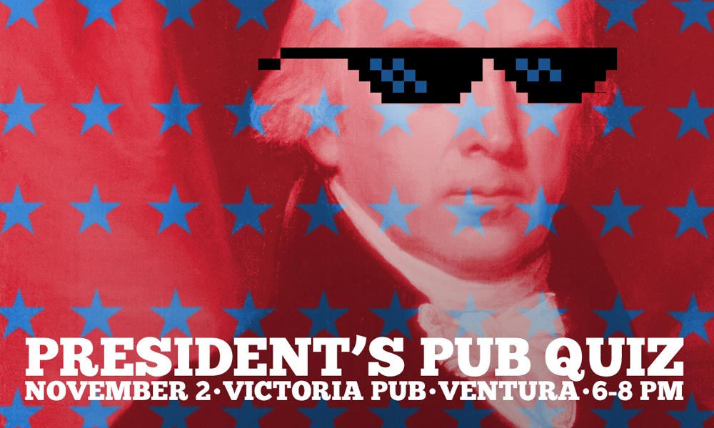
President’s Pub Quiz
November 2016
My veins ran thick with hubris near the end of my second (and most successful) year as AIGA SB President: high chapter membership, multiple events per month, and a strong board of directors supporting me. I figured I could get away with something fun for November, and everyone would just have to deal with it—so this event’s branding flaunted that attitude in the goofiest way.
We’d had a successful Design Quiz Night earlier in the year, and replicating it would be a great way for me to celebrate my 40th birthday with design pals and watch the Cubs win the World Series. It was a flimsy excuse to stage an AIGA event, but I threw together some stars-and-stripes imagery alluding to the bonkers 2016 election, gave James Madison (like me, the fourth president) some meme-worthy shades, and called it the “President’s Pub Quiz.” We all had a grand time.
A week later, karma paid me back with the actual election result, but that didn’t take away one of my favorite personal moments of using all the power I had to design a monumentally silly (yet entirely on-brand!) image for a fun night.
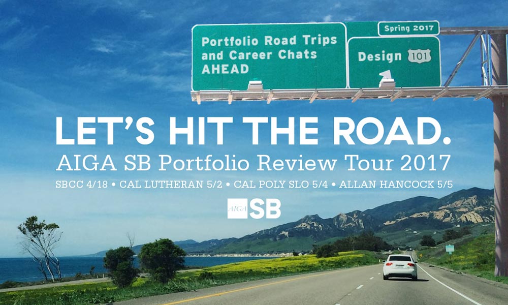
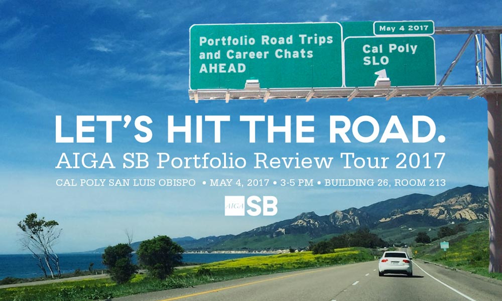


Let’s Hit the Road: Portfolio Review Tour
April/May 2017
Portfolio reviews are an AIGA institution, both for AIGA SB and the other chapters around the country. Any opportunity for design students to get constructive criticism and career advice from seasoned professionals is welcome, but sometimes these events could become massive, day-long logistical nightmares. After 8 years of this, our chapter inverted the format, informally touring local colleges to bring professionals to the students instead of making them come to us.
Going on the road was such a change from our previous practice that I thought it deserved some major emphasis. To create the event branding, I combined sketches from AIGA SB’s education director with one of my own snapshots from U.S. 101 on the Gaviota Coast. Adding a huge urban freeway sign for event details made the image contradictory enough to get attention on any digital platform.
I went with a common interstate sans serif typeface plus AIGA’s standard fonts (from their 2015 rebranding by Kiss Me I’m Polish). The snapshot’s composition made it easy to edit dimensions for social media and for details of each college we visited (SBCC, Cal Lutheran, Cal Poly, and Allan Hancock). The event was successful, pairing up more pros with students than at any previous one-day session.
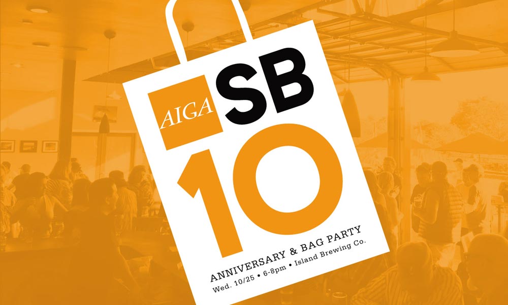

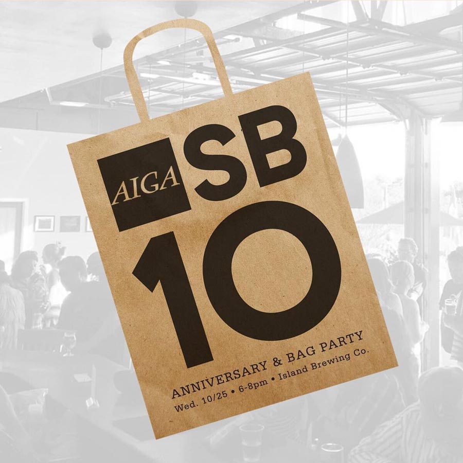
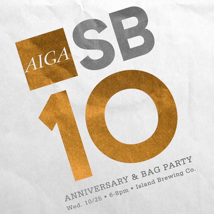
10th Anniversary and Bag Party
October 2017
Different AIGA chapters celebrate their anniversaries in different ways. Some big-city chapters go all out with swanky galas in famous venues. Some older chapters try to outdo their 10th anniversary with bigger 20th or even 30th anniversary bashes. AIGA Santa Barbara was different: our budget allowed for a first-drink’s-on-us meet-and-greet, with a recycled (but still good!) theme: show your stuff!
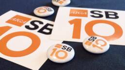
At our 2011 “bag party,” attendees brought samples of their work instead of business cards—for an instant ice-breaking talking point—and a bag to collect work from fellow attendees. When we revived that for this event, I hauled out the 2011 branding to update it for 2017 with our chapter color palette and an “AIGA SB 10” type treatment, all atop a screened-back image from our chosen venue.
The simple branding proved versatile; we expanded it to a secondary brown-bag color palette for online promotion, and also created stickers, drink tickets, and tiny “AIGA SB 10” buttons. It was great to not have to start from scratch; building on previous work is often Brand Design 101, allowing either complete identity continuity or (at the very least) subtle, tasteful visual throwbacks.
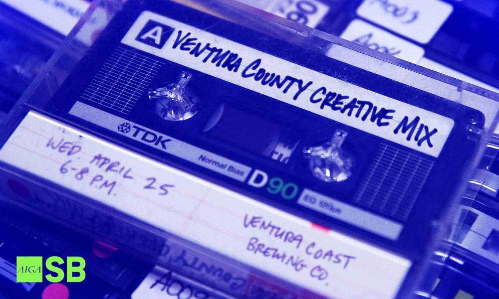
Ventura County Creative Mix
April 2018
Small mixers are the bread and butter of local AIGA events, so one thing you learn quickly on an AIGA chapter board is that there are a zillion ways to describe local meetups, and with much more exciting words than “networking.” Whether it’s “Come Meet Your Kind” (designers will get it) to “Mingle Bells” (for the holidays) to “Cocktails [or Caffeine] with Creatives,” dressing up a tired old meet-and-greet in snazzy superlatives will always boost interest.
I definitely went that direction when planning the Ventura County Creative Mix, mashing up a visual pun with a sensible serving of nostalgia to make a “mixer mixtape” image, complete with handwritten details and a thick, Sharpie-scrawled title. The final touch was dunking it in a lurid, RGB-optimized color palette of lime, magenta, and metallic blue.
Like many other small events, the marketing was all-digital so we didn’t need much else—no fancy print campaign here! As long as the image could work in a 5:3 box (for the website), 16:9 box (for email marketing) and a square (for Instagram and/or other social media), we were good to go. Sometimes the simplest, pun-powered idea can be the best one!
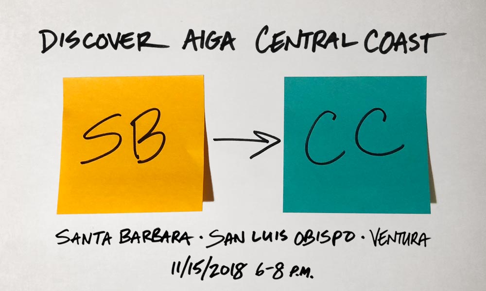
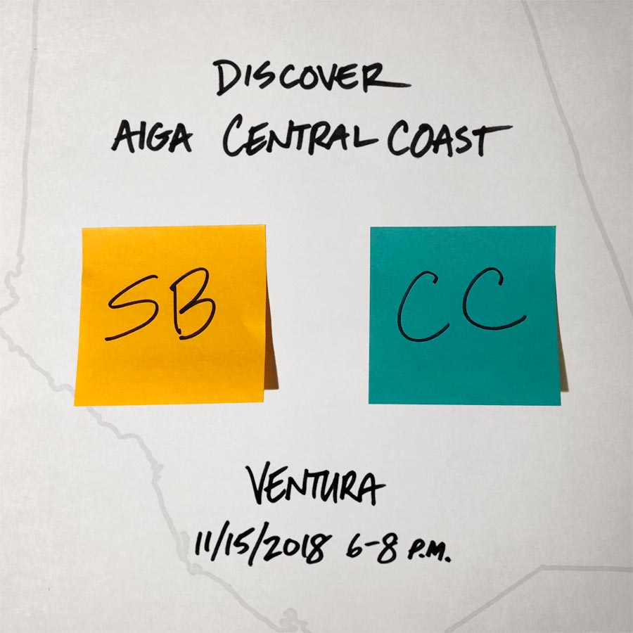
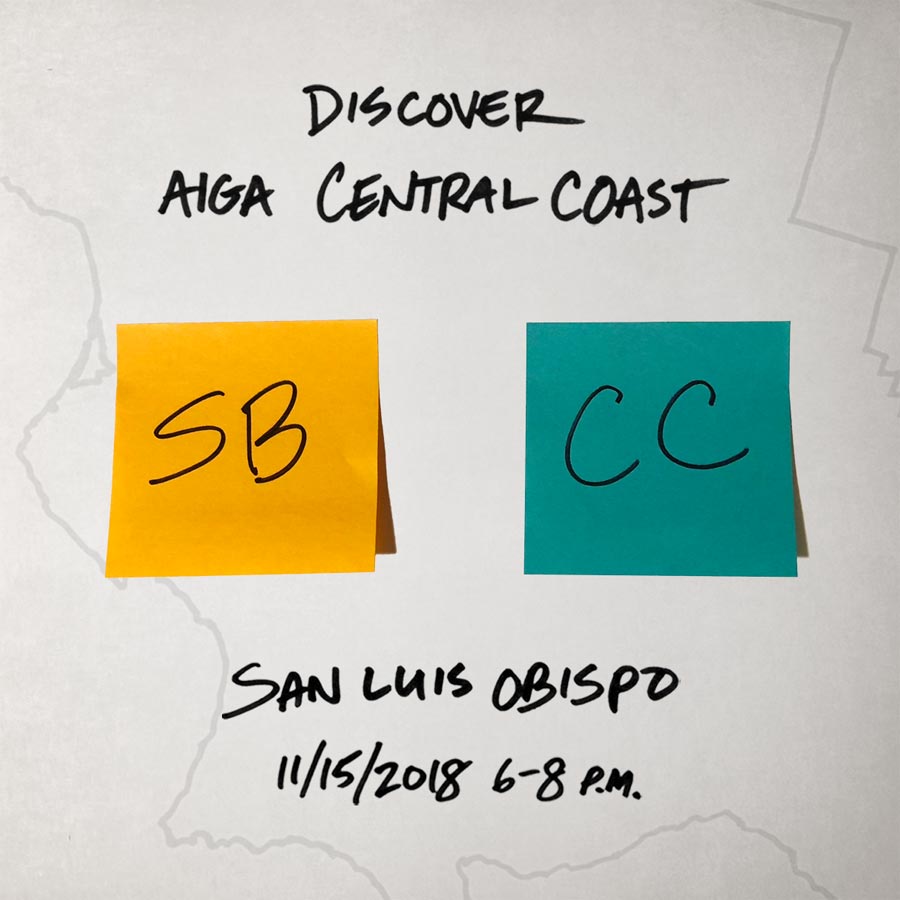
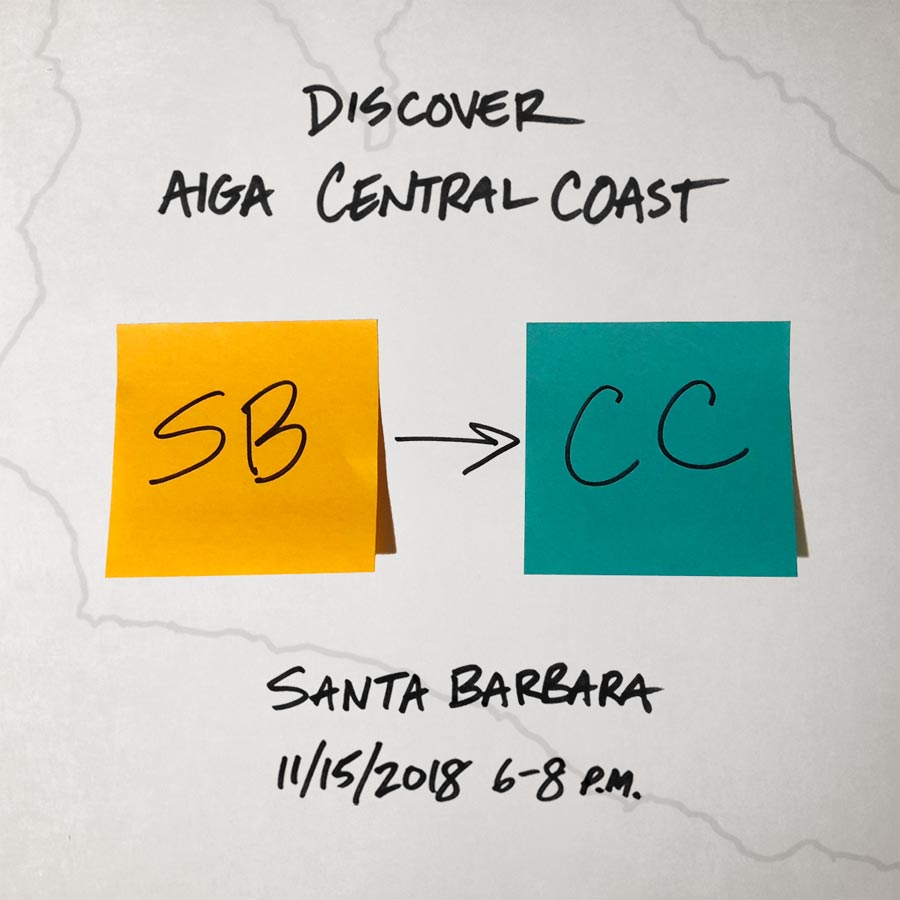
Discover AIGA Central Coast
November 2018
That lesson about simplicity goes double for this event’s branding—the happy result of last-minute, out-of-nowhere inspiration. My final rodeo as AIGA SB president was a simultaneous three-location community meeting about the chapter’s 2019 transformation from “Santa Barbara” to “Central Coast.” Our chapter would finally become in name what it always had been: a small but agile regional organization representing creative professionals across three Southern California counties: Santa Barbara, San Luis Obispo, and Ventura.
My first idea was to combine maps with stunning aerial photography to depict the wide-ranging nature of our new incarnation. However, that imagery plus the event’s title inadvertently conjured a travel/tourism vibe far from our actual purpose. Each meeting would be a creative conversation, done design-thinking style, about what local designers wanted and needed from our chapter. Event promotion was already happening, and RSVPs were sluggish, so I had to inject some clarity—and quick!
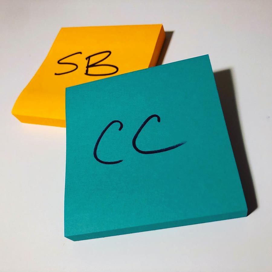
A simple visual representation of the actual event would have to do. Inspired by sticky-note-saturated design thinking imagery, plus the color palette from AIGA National’s 2015 rebranding, I scoured local office-supply shops for orange and teal Post-Its to match the old and new chapter colors. The end result was perfect, despite coming together only five days before the actual event. I definitely went out in dramatic (and tacky) fashion, but it worked—all three meetings generated lots of ideas for the chapter’s next incarnation.
From Volunteer to Career
Cutting my event-branding teeth with a local AIGA chapter was the perfect segue into the work I did with Tight Ship. I had creative freedom to translate nebulous concepts into compelling visuals, helping make events exciting to attend and vivid to recall. I got to do this for diverse productions and audiences, experimenting to find out what worked and what flopped, and collaborate with and learn from my creative professional peers on the chapter board of directors.
It’s a great example of doing what you love, and doing it well enough, to get noticed and hired for bigger and better projects. By the time I stepped down from the board in 2018, I had seven years’ worth of substantial event branding experience under my belt. It’s been fun to apply that across multiple media and help ensure my clients’ attendees anticipate a fun experience before going, enjoy a great time during, and share their stories after each event.